Mendeley
From January 2016 to December 2017, I worked on Mendeley core software products (by Elsevier), helping researchers managing and citing their references with functional desktop, mobile, and tablet applications.
Top Responsibilities
UX Research
UI Strategy
BAU Product Design
I’ve worked on the new IA for the core desktop application, producing wireframes, concepts and designs, all supported by validated prototypes. I have also been an active part of the Mendeley brand restyle project, creating POCs, participating and running workshops in London and Amsterdam, and supervising the Elsevier style endurance in desktop, mobile and web apps.
Data collection
UX RESEARCH – TEAMWORK
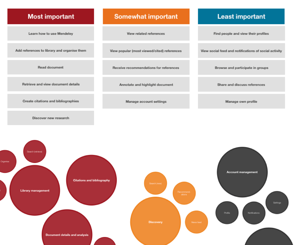
At first, we needed to know more about how users think and behave in terms of reference management.
What are the main user goals? What are the critical business requirements?
Running workshops with all the other teams working on products connected to the reference manager, we designed a first mental map of user objectives, based on in-person user sessions, card sorting and online surveys.
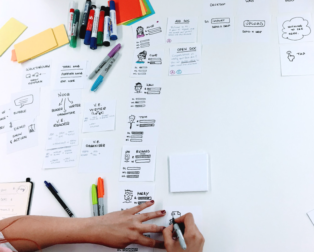
Who are our personas? What archetypes should we focus on?
Thanks to datasets of acknowledged behaviour and pain points, we’ve identified realistic personas and archetypes, powerful design tools during the following UX and UI phases.
Strategy & User journeys
UX RESEARCH – TEAMWORK
One of the most valuable lessons I’ve learnt in Mendeley is the importance of excellent communication both inside and outside the team. The reference manager team used to sit and work very closely with our POs and PMs: supporting them and, when needed, being involved in tactical scope decisions. I always thought this was a brilliant solution set in place by the Head of Design (Patrick Shine) to create a functional, trusted team.After several workshops and alignment sessions with the development team, we felt confident to finally kick-off the UX strategy phase, that would create a solid ground for the UX and UI design artefacts that would have followed soon after.


PAPER
When the task was relatively simple, and when the journey was still in the first, embryonal stage, I designed paper user-flows. Low-resolution wireframes are great to check and test simple user journeys with POs and PMs, developers and occasionally users.
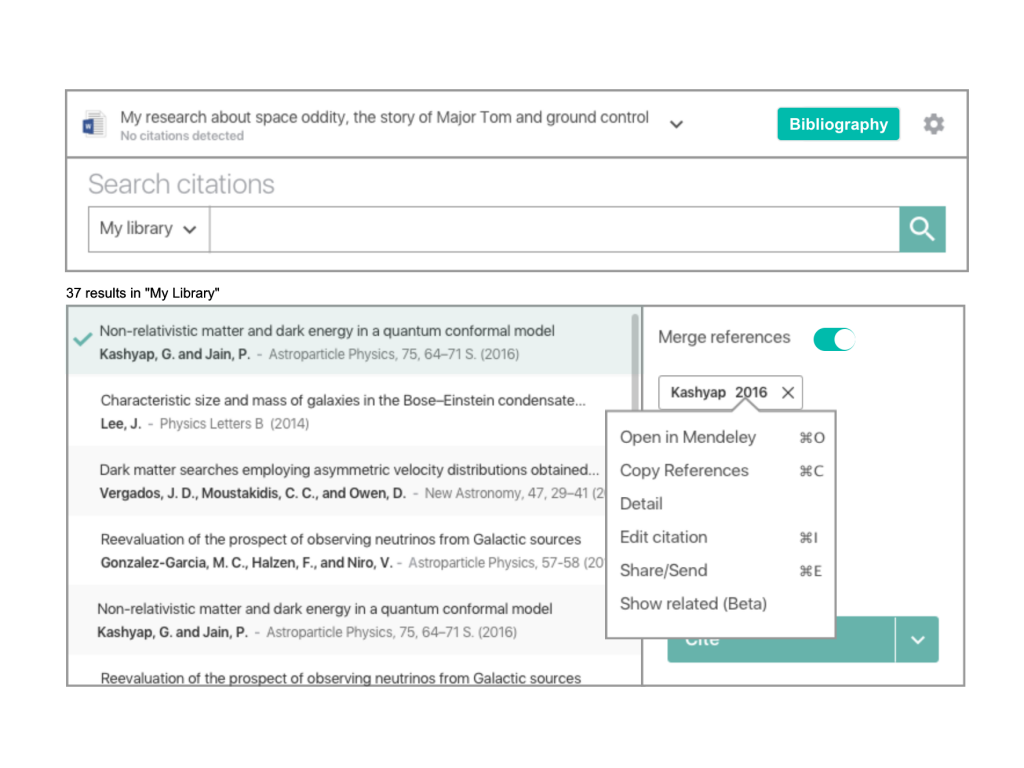
For the Citations manager, I used paper prototypes to test my initial ideas and assumptions: the re-iterations were quick, and the collaborative design with users was brilliant.
PROTOTYPES
Digital prototypes are usually the standard result of the UX process; I typically work with online services such as Invision app and Marvel. For the citations manager, we produced a comprehensive, validated, prototype (273 screens): we tested it in-person with 48 users in Amsterdam and London, and 33 users in the world, with remote testing.
The results, shared with Elsevier stakeholders, convinced the business to consider a complete restyle of Mendeley reference manager.
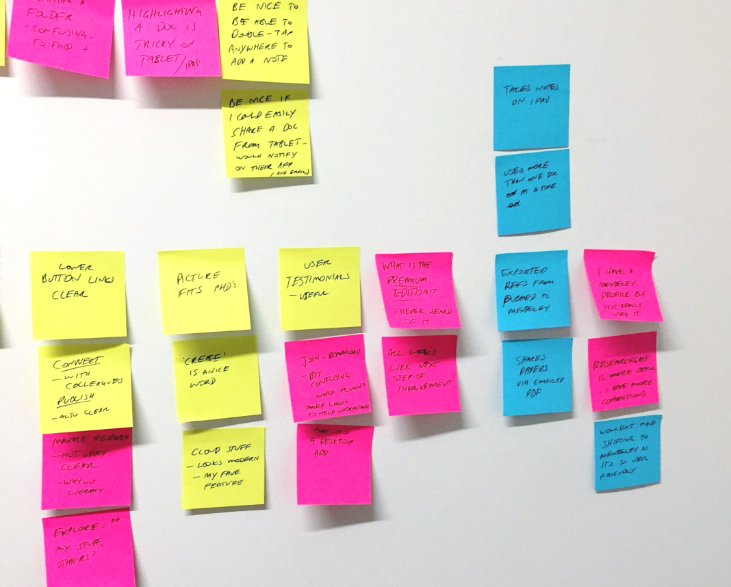
TESTING
User sessions were part of the weekly routine in Elsevier: 6-8 users came in every week to have a 1-hour in-person session with two UX designers in the Lab. The sessions were recorded (Lookback) and the note-taker was in charge to add comments (later shared with products owners, stakeholders, and developers).
Friday’s beer o’clock was a great moment to share the best insights, and usually to let colleagues know if users loved the product.
UI Design
During my two years in Elsevier, I was leading the UI approach on the native mobile, desktop and tablet applications with the goal was to create a new design language, a cross-platform pattern library including the Elsevier guidelines and the new Mendeley identity.
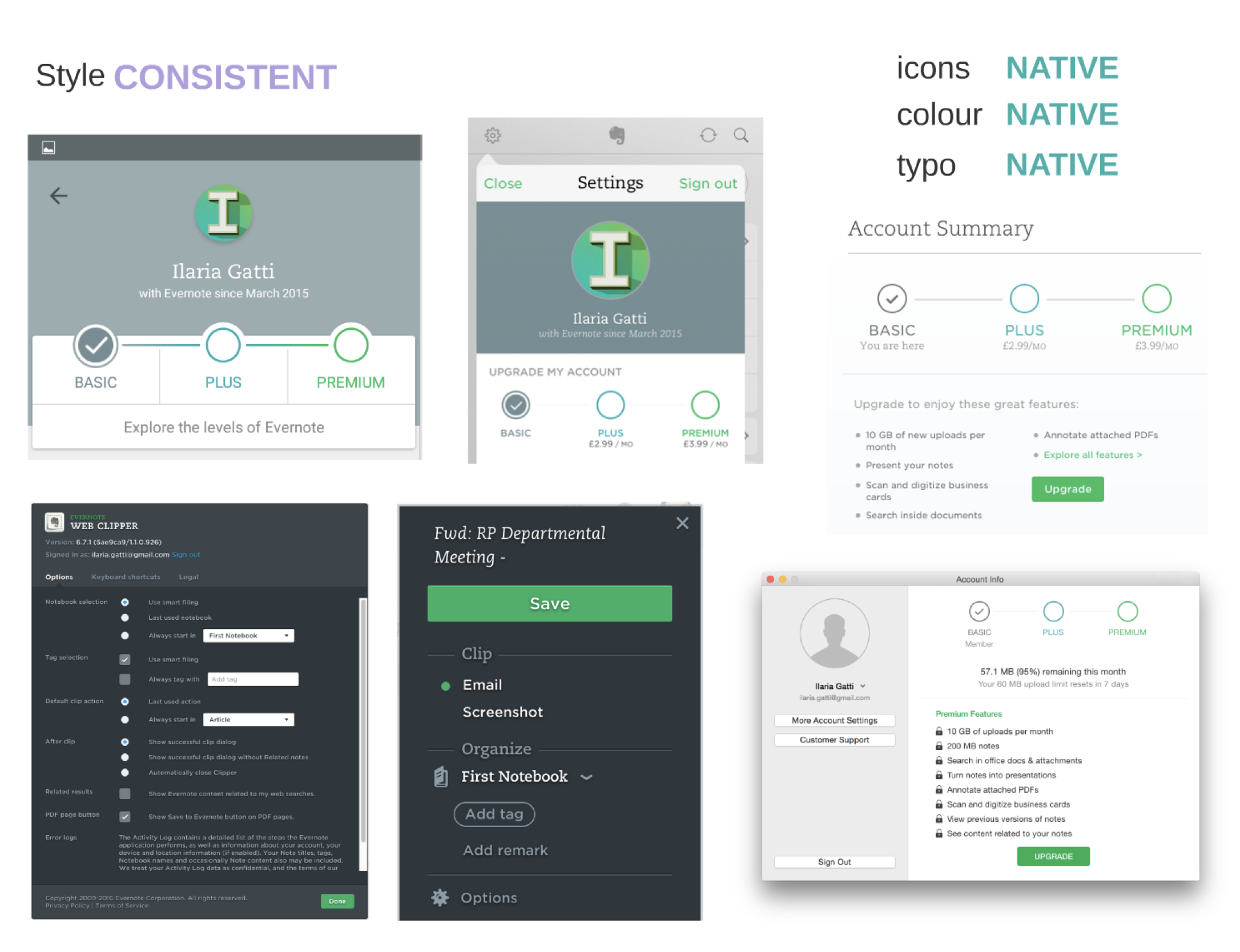
My roleColour paletteConsistent (but native) appsIcons and pictogramsMy role
As expected, the Elsevier redesign project was enormous and likely to be a continuous, re-iterative process that will continue for a decade. My involvement was on its first draft, mainly focused on the native software applications, used by over 3.5 million people (2016). Still, thanks to the very open-minded, accepting culture created by the Head of Design, I had the opportunity to give my input and influence approaches, strategies and designs for web components as well.
The results are already visible online, in both the web application and desktop applications.
Colour palette
UI DESIGN – TEAMWORK
One of the first steps was to harmonise the two brand colours, Red and Orange, creating at the same time new tints that could work well as secondary colours.
Mendeley Red
#E81C2D
Elsevier Orange
#FF8200
Anthracite
#323232
Light Grey
#A7A8AA
Consistent design language with native interactions
UI DESIGN – SOLO
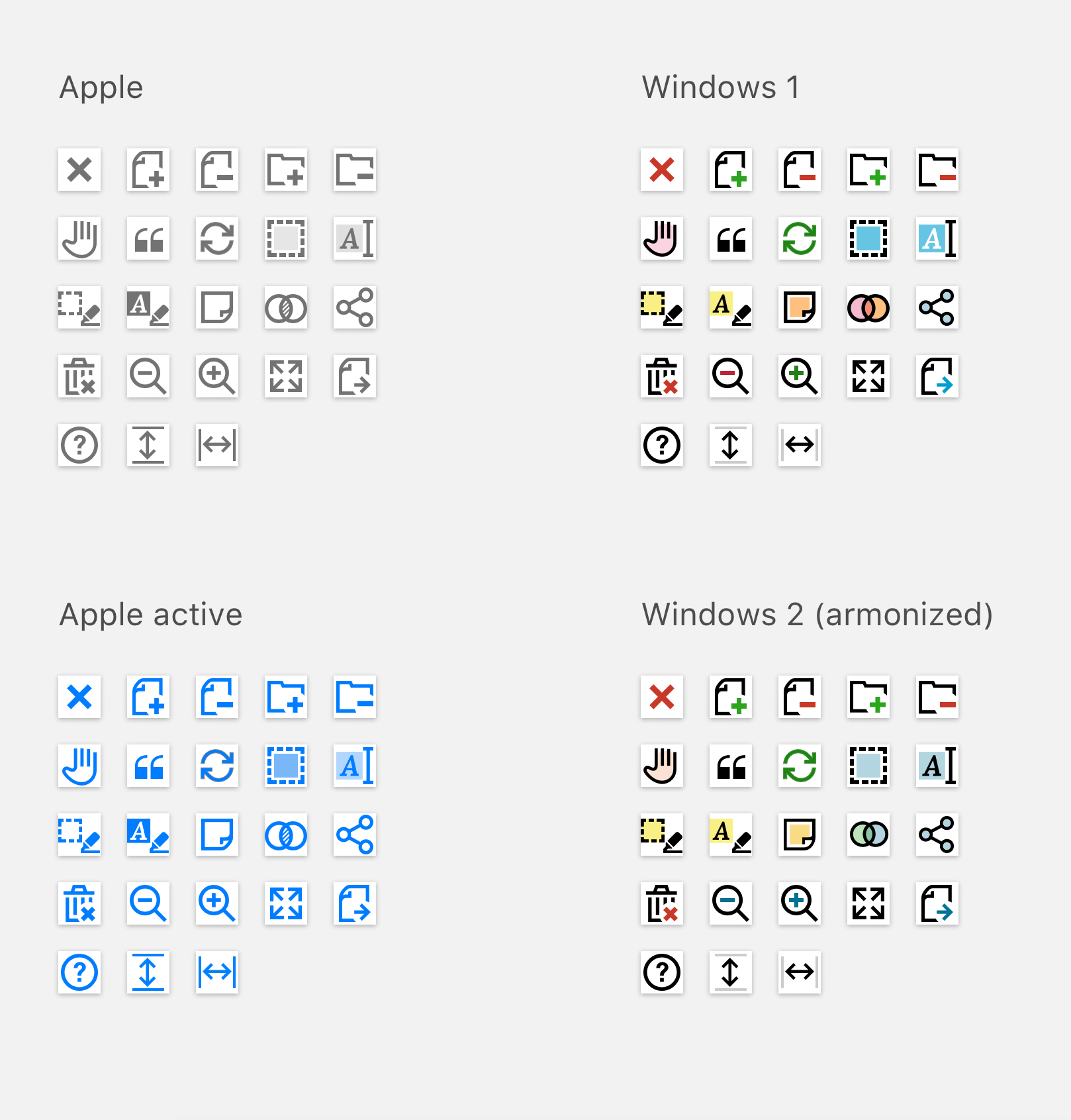
The most challenging issue I’ve encountered when working on the UI design of the Mendeley native applications (iOS and Android) was drawing the line between OS guidelines (for example Material design for Android devices) and design language consistency.
To reach the best compromise I’ve done an extensive competitor analysis, tackling down all the elements (usually trying to apply an atomic design approach) that would help consistency improving the usability of the app.
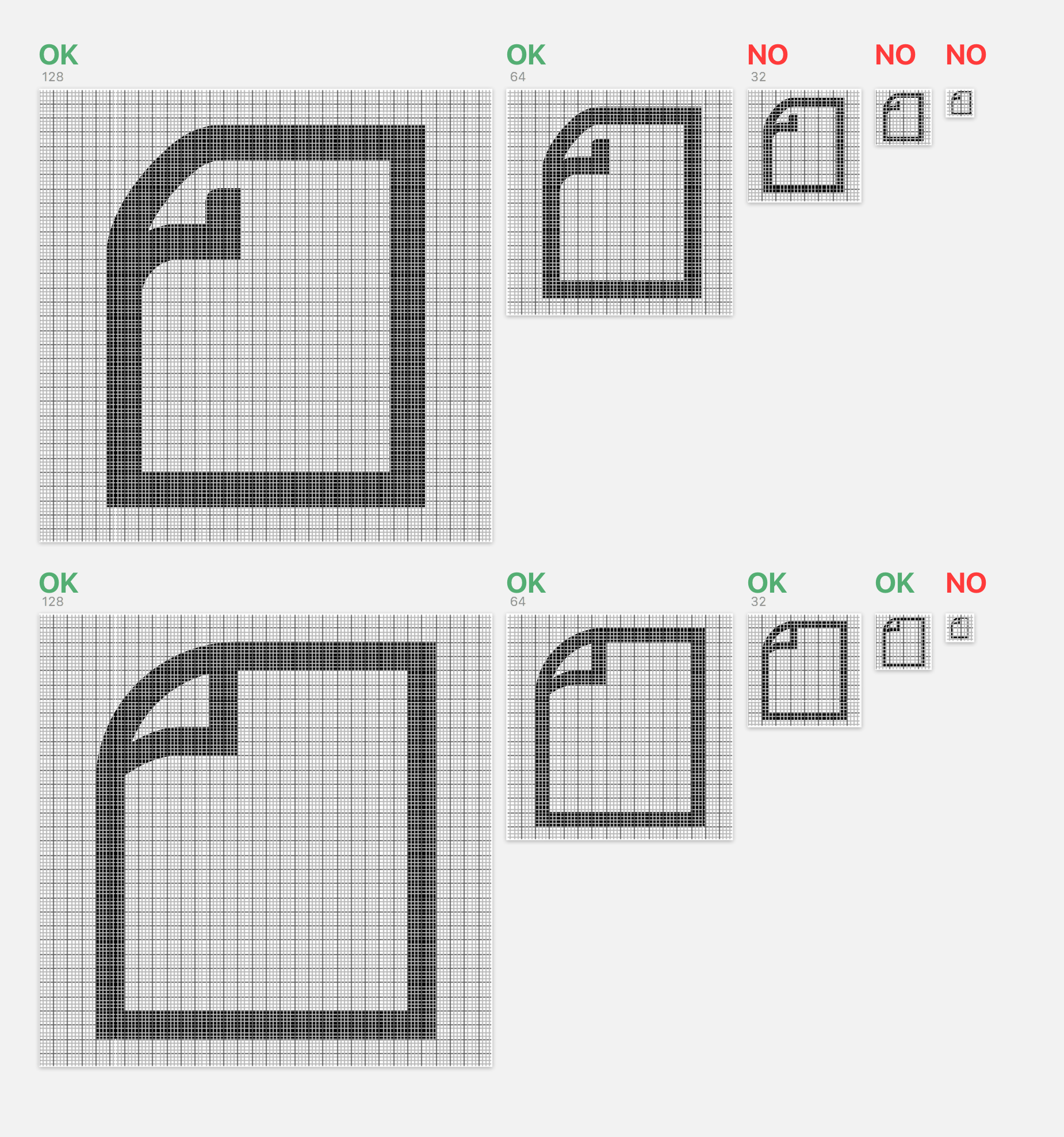
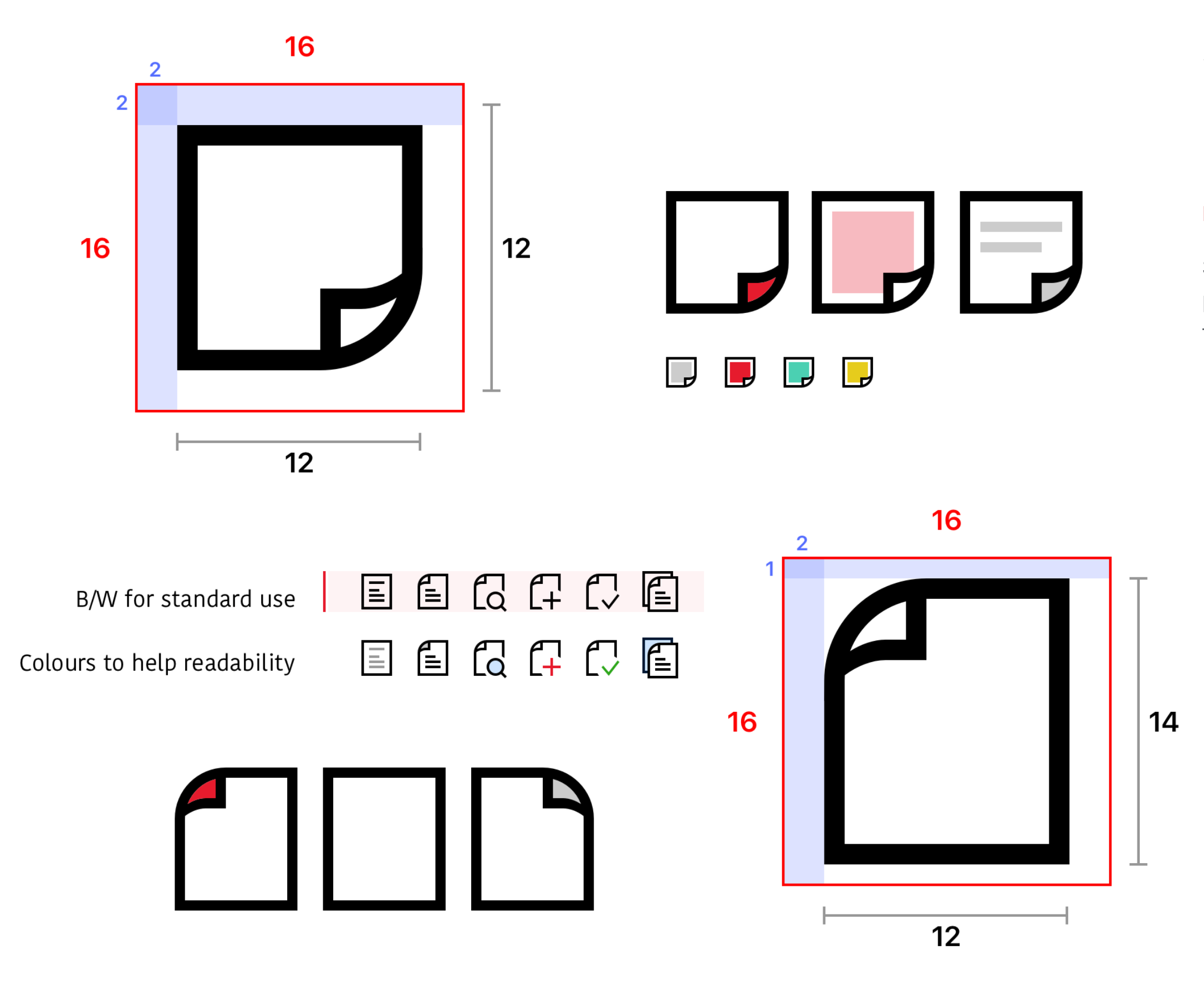
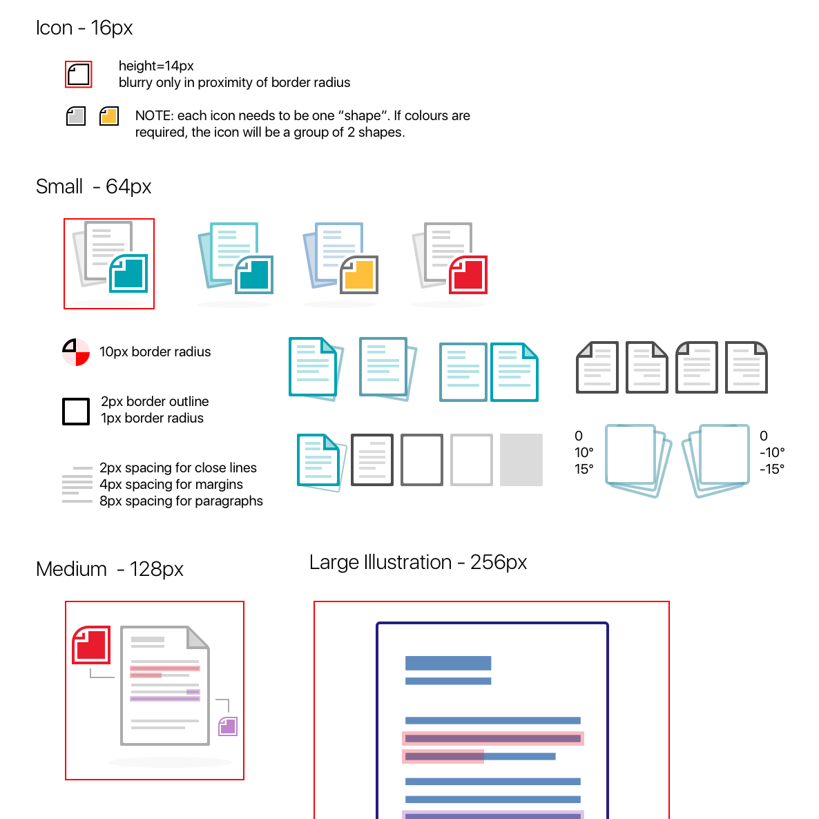
A scalable icon set
UI DESIGN – SOLO
Elsevier master brand guidelines had a set of icons with 250+ pictograms in it: unfortunately, the icons are created on a 64px grid (anything below 64px was looking blurry), and they didn’t come with a manual with guidelines to design new ones.
I was put in charge to create a set of rules to generate brand consistent, multi-platform pictograms that would allow me and other designers to produce the icons needed (especially for our native applications).
A final look


