Unibuddy
Driving engagement through strategic leadership
As Design Lead at Unibuddy, I shaped design strategy across B2B and B2C products and elevated how the team operates. I introduced research practices, evolving the brand for enterprise needs, and driving targeted product improvements.
Role: Head of Product design
Duration: November 2022 – September 2023
Team: 5 Designers across cross-functional squads
Three challenges
Unibuddy connects prospective university students with current students and universities.
When I joined, three critical issues needed resolution:
Inefficient design practice
The team lacked structured processes, leading to rework and misalignment.
Low engagement on native app
86% of students wanted to connect with peers, but actual engagement was minimal.
Brand perception misalignment
The illustration style felt “childish” to enterprise customers, creating friction in B2B sales.
MY INITIATIVES
#1 Established a design
process framework
THE PROBLEM
Design decisions were made reactively without consistent validation, creating rework and stakeholder misalignment.
WHAT I DID
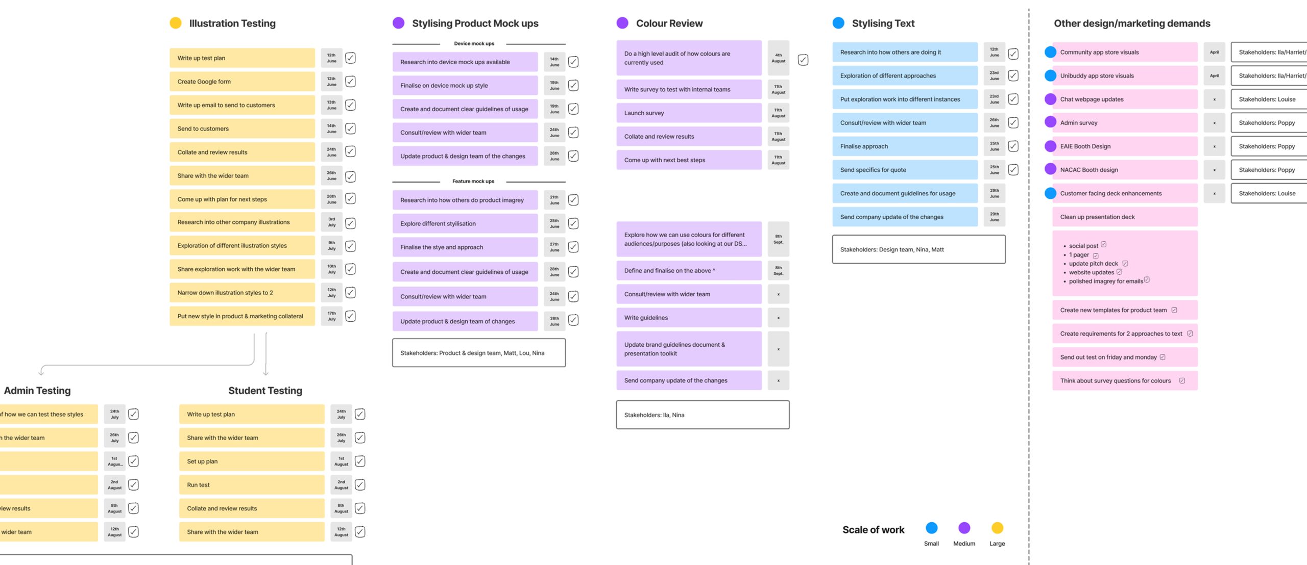
Implemented an 8-week discovery-to-delivery framework that embedded design thinking across product development. The framework structured research (weeks 0-2), problem definition (weeks 2-4), ideation with engineering (weeks 4-6), and validation testing (weeks 6-8). This created consistent touch-points for cross-functional alignment and reduced the ambiguity.
Ensuring that the scope is clear, making sure we are building the right feature (and not just building the feature right).
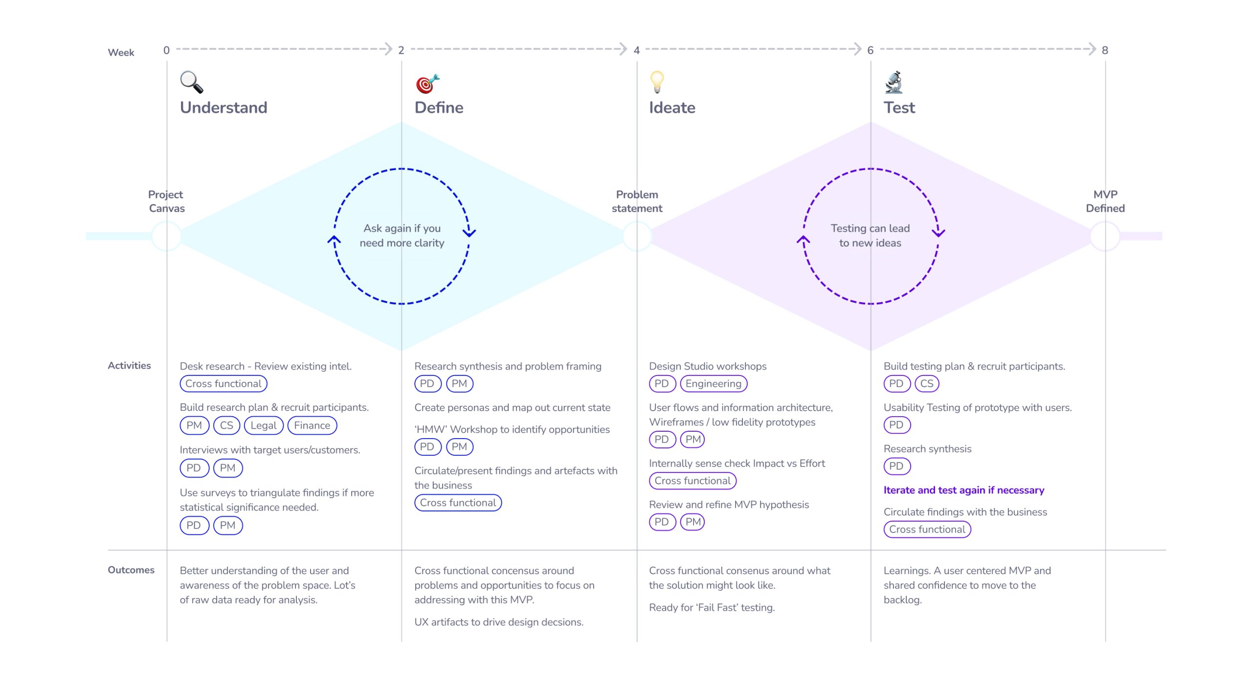
Cheatsheet showing all the checkpoints needed (across departments) from ideation to delivery.
Data informed approach: measuring pain-points and success before, during and after release.
INITIATIVE #1
Business impact and leadership outcome
This framework is now the standard across all product squads, enabling designers to work more autonomously while maintaining quality and alignment.
I also built a progression compass to track IC’s progress , giving designers clear visibility into their growth path and the skills needed to advance.
MY INITIATIVES
#2 Community app improvements
THE PROBLEM
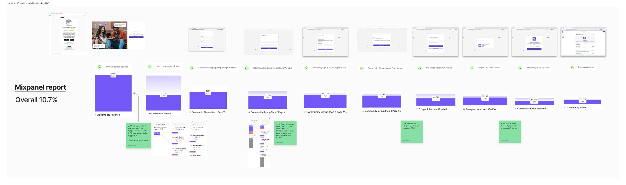
Despite 86% of students expressing desire to connect with peers, the metrics showed minimal interaction. The carousel’s poor information architecture and unclear UI patterns were preventing engagement.
Primary KPI: MAU/DAU, Product “stickiness”
Secondary KPIs: New connections made, Number of messages sent
The old carousel
❌ No valuable information
❌ No incentive to enrich the profile
❌ Copy is not clear (these are not connections)
❌ UI easy to miss
❌ No room for more content
The new carousel
✅ Relevant information
✅ Profile picture is prominent
✅ “Find your people” copy
✅ Stands out
✅ Adding bio
INITIATIVE #2
From quick wins to product strategy
These tactical improvements validated a “quick wins” approach that became our product strategy. By focusing on high-impact, low-effort changes, we created momentum that built stakeholder confidence in design-led initiatives and unlocked budget for larger platform improvements.
The improvements required minimal engineering effort (2 sprint capacity).
10% effort, 10x engagement impact.
MY INITIATIVES
#3 Brand evolution strategy
THE PROBLEM
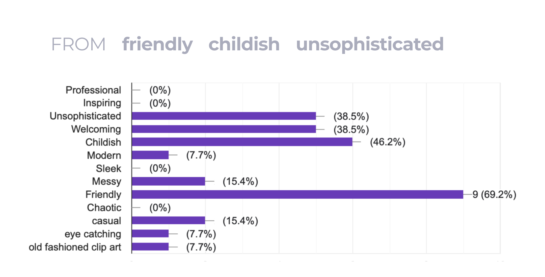
Customer surveys revealed the brand was perceived as “friendly” (positive) but also “childish” and “unsophisticated“.
WHAT I DID
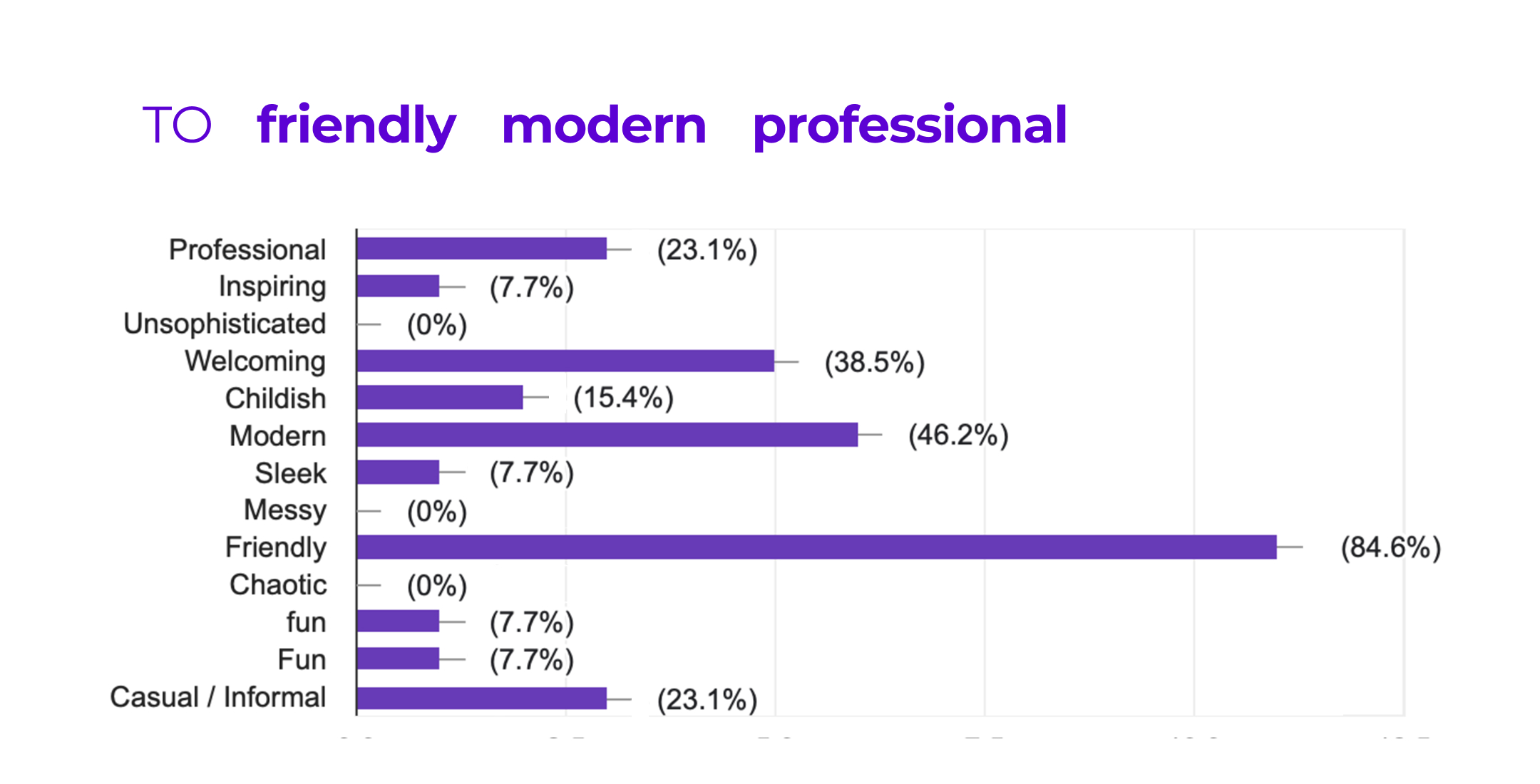
Conducted research with 50+ university (customers) to quantify perception, analysed the competitive landscape, and identified the need to maintain approachability while adding professionalism. After exploring seven illustration style directions, we have selected an outline vector style with monochrome and accent colour that balanced both needs. Creating comprehensive guidelines enabled company-wide adoption without requiring design team involvement for every asset.
Before the brand evolution
After the brand evolution
Q3 Brand design evolution roadmap
INITIATIVE #3
The outcome
Successfully positioned design as strategic partner in business transformation. The rebrand supported Unibuddy’s evolution from startup to established SaaS platform. The brand perception shifted from “childish” and “unsophisticated” to “modern” and “professional”.